A joke about Ariana Grande sounding like a font. A challenge to create it. 3 weeks of crafting. 1 minor explosion on social media.
Result: 280+ characters. Available now.
7-Eleven annually runs their 'Bring Your Own Cup Day' giving customers the chance to bring in any vessel they desire to fill with Slurpee.
This idea was devised to generate social engagement on the day. The opportunity to have access to a 3D printer was put to good use with a competition designed to recreate the winner's head in the form of a cup. The best idea for a vessel determined the winner and free Slurpee for a year sealed the deal.
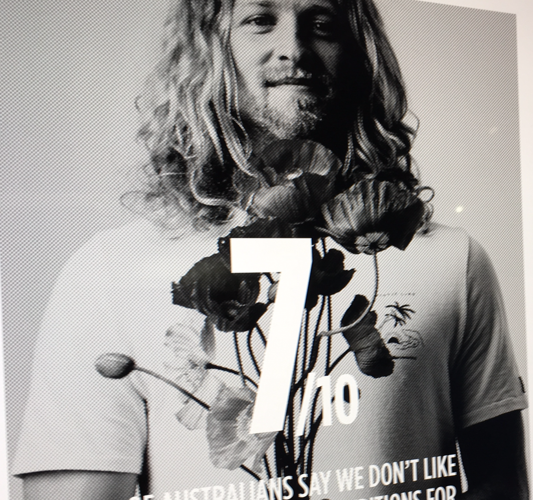
As the leader in on-demand insurance in Australia, Sharecover had the unique opportunity to position as a new kind of insurer; one that’s modern, bold and confident – matching a progressive, bright and ambitious audience.
The opportunity was to make Insurance vibrant, cool something it seldom is.
The CGU white paper was created to look at where ambition stood in Australia today.
The content was telling and so the idea was to let the content speak. With a minimal treatment of colour, type, and imagery, the result was a strong document that really delivered the message in a powerful way. The earned media was enhanced by its tabloid-size and it being handed out at train stations throughout the country.
The look and feel of this concept responds to the moment that AI is in at the moment. This brand looks to show the more human aspect of the field.
The brand is designed to change with time as the logotype expresses the inner working of the maths and tech aspects of the endeavour.
The imagery and graphics help to humanise and gather trust with the audience with imagery that has a technological feel but is from nature.
The AAMI SmartPlates mobile app, tracks every drive, so Learners can focus on the road while their practice hours, routes, road type, weather and traffic density are recorded via an app. The UI was simple and clear and respectful to brand guides. The app won seven Cannes Lions awards – including one gold.
Sales in the bottle store have never been easy for Guinness as the quality is affected greatly by the pour that requires an expert and a tap to perfect. However, with new advances in the packaging, it was possible to get a really good pour. The customer just needed some education on how to achieve it.
The solution was an app that showed a series of steps on how to get the best pour at home.
Aotearoa Fisheries Typeface uses a series of ligatures that extend cross bars and serifs into Maori inspired decorations.
The typeface was commissioned to be used throughout Aotearoa Fisheries annual report that was beautifully designed by Saturday an Auckland based design and brand agency.
The Kiss ready lip balm product brand has been marketed in a new way to reach its main target audience. One that is an 18-24 customer looking to be natural and themselves.
The brand is a single-minded one that looks to make being 'natural' sophisticated and fun. This idea permeates social media, digital and print.
So if you’re into natural beauty or thinking of trying an effective, safer alternative to chemical skin products please visit www.kissreadylips.com
How do you capture the excitement in food innovation?
An explosive brand identity development for a New Zealand government initiative to encourage food innovations through its assisted programs.
A magnetic wall. Signage that really made a statement on the street. A light fitting that was visually realised from recording ‘HUCKLEBERRY’ as a sound wave and a 30m illustration explaining the creative process design to go over two levels. All this combined to inspire their employees and confirm to clients that creativity was at its heart.