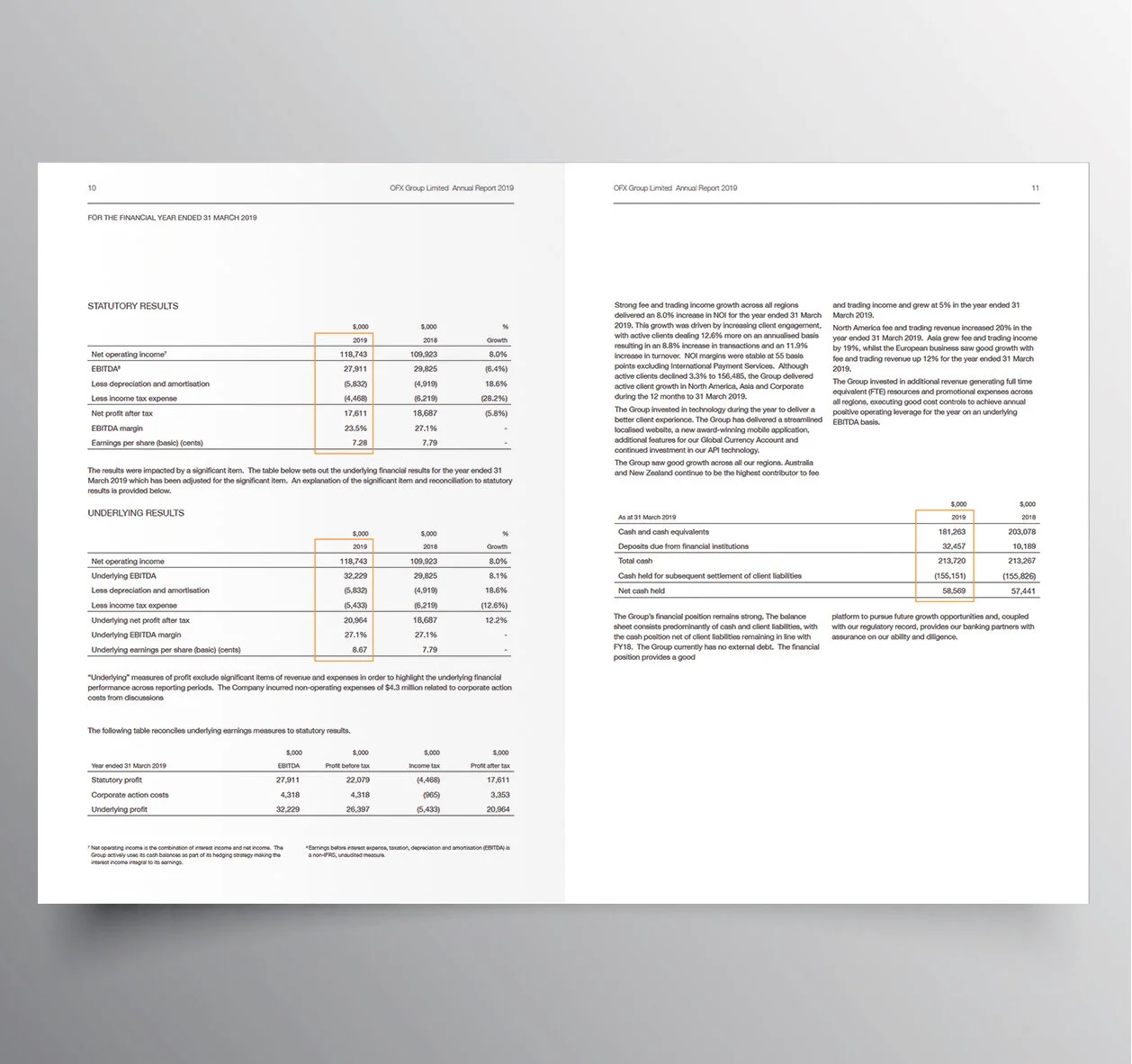
The OFX report brief was to do not very much and just keep it simple. The opportunity from our point of view was to deliver a typographically strong and bold design that got the reader to the numbers.
We also built a strong concept of momentum and used simple graphic moments to express it. Arrows indicating growth at a 45˚ angle, strong vibrant orange throughout, and a light font all worked to suggest the company was nimble and positively moving towards�the future.